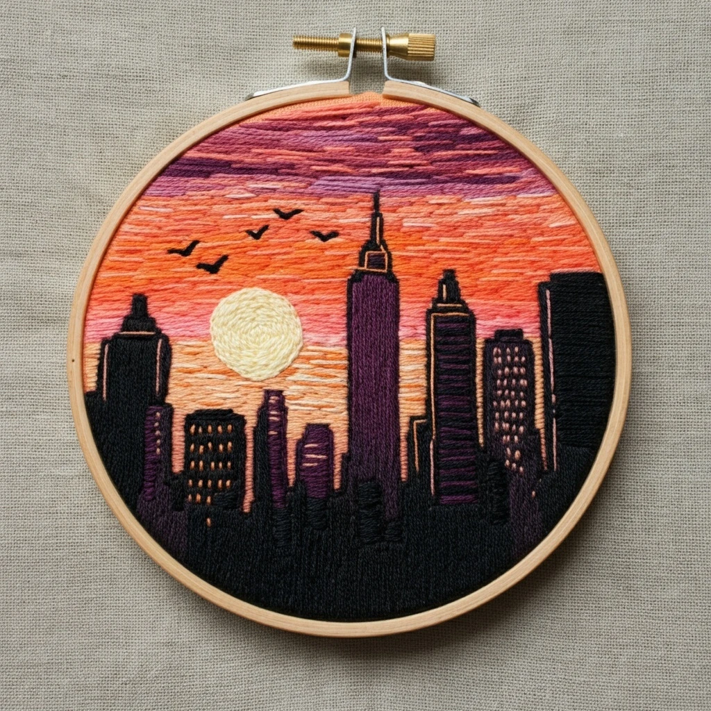
Embroidered Sunset Cityscape Silhouette
This design reads as a warm, glowing sunset framed around a bold city skyline silhouette. The strongest visual story comes from the smooth sky gradient: pale sunlit peach in the center, richer coral and salmon bands around it, and dark architectural forms anchoring the composition.
A polished result depends on keeping the sunset transitions soft while letting the buildings stay crisp and graphic. The palette below is chosen to echo the design’s peach, apricot, coral, dusky rose, and charcoal tones while still being practical for hand embroidery.

Design analysis
The composition is built around two contrasting ideas: soft atmospheric color and hard graphic silhouette. The sunset area appears luminous and layered, while the cityscape is dark, simplified, and shape-driven. That means your stitching plan should keep the sky blended and airy, but make the skyline edges neat and confidently defined.
Color story
Warm neutrals, peach, coral, salmon, and dusty red-browns dominate the sky. Deep gray-browns and black shape the buildings.
Texture balance
Use smooth, directional fill stitches in the sky and denser, flatter coverage in the silhouette to keep the contrast visually clear.
Visual priority
The eye should go first to the glowing center of the sunset, then travel across the skyline outline and any distinctive architectural peaks.
Suggested DMC color palette
The palette below is intentionally compact and practical: enough range for a beautiful gradient, but not so many shades that the project becomes fussy. If you prefer a simpler version, keep the core set: 3823, 3341, 351, 3712, 3799, and 844.
Where to use each palette group
| Area | Recommended colors | How to stitch it |
|---|---|---|
| Bright sunset center | 3823, 3770, 353 | Work with 1–2 strands in long and short stitch or very close split stitch so the center glows softly without looking blocky. |
| Main sky gradient | 950, 3341, 351, 3712 | Blend in overlapping rows. Let each new color travel slightly into the previous section to avoid hard bands. |
| Deep sunset edge / dusky accents | 918, 3712, 351 | Use these more sparingly around edges or darker cloud-like shapes to deepen the atmosphere without overwhelming the glow. |
| Cityscape silhouette | 3799, 844, 3021, 310 | Outline first with backstitch or split stitch, then fill with satin stitch, split stitch, or tightly packed long-and-short for solid coverage. |
| Fine skyline details | 310, 3799 | Use 1 strand for narrow spires, roof peaks, antennae, tiny windows, or small breaks between building forms. |
Stitching suggestions
Recommended stitch types
- Long and short stitch: best for the sunset sky because it creates smooth color transitions.
- Split stitch: ideal for controlled fills in curved or irregular sections and for outlining before filling.
- Backstitch or stem stitch: excellent for defining the skyline contour and keeping architectural edges crisp.
- Satin stitch: useful on broader, simple building shapes when you want a dense, sleek silhouette.
- Straight stitch: handy for tiny accents such as sharp spires or minimal structural details.
Thread-count guidance
- 1 strand: ultra-fine outlining, tiny skyline tips, delicate gradient blending, and narrow details.
- 2 strands: the best all-purpose choice for most of the design, especially sky fills and standard outlines.
- 3 strands: good for bolder silhouette coverage if you are using a slightly heavier fabric or want a more graphic finish.
- Blended needle: try one strand of 3341 + one strand of 351, or one strand of 351 + one strand of 3712 to soften mid-sky transitions.
Blending, outlining, and shading guidance
Blending ideas
- Start from the lightest center and work outward. It is usually easier to preserve luminosity that way.
- Overlap stitch lengths between neighboring colors rather than changing shades on a hard line.
- For a soft painterly look, alternate a few stitches of the next shade into the previous section before fully switching colors.
- If the design includes subtle cloud edges or atmospheric shapes, use 353 and 950 as gentle transition buffers.
Outlining and silhouette depth
- Trace the skyline first with 3799 or 844 so the city form stays accurate while you fill around it.
- Use 310 only for the darkest accents; keeping some of the silhouette in 844 or 3021 makes it richer and less flat.
- To suggest depth, place 844 on building tops or side edges and 3799/310 in deeper recesses.
- Keep stitch direction consistent within each building shape so the silhouette looks intentional and clean.
Shading guidance
For the sky, think in broad bands rather than tiny isolated patches. Let the brightest values sit near the visual center, then step gradually into peach, apricot, coral, and dusky salmon tones. If you need extra drama near the outer edge, add a little 918 in short, sparing sections.
Texture suggestions
Keep the sky texture smooth and light. The silhouette can be slightly denser and flatter to strengthen the contrast. If desired, tiny directional stitches can hint at subtle architectural structure, but avoid too much interior detail or the skyline will lose its strong graphic effect.
Beginner-friendly practical tips
1. Test your gradient first
Make a small stitch sample on scrap fabric before starting the hoop. Test the order 3823 → 3770 → 353 → 3341 → 351 → 3712 to see how soft you want each transition.
2. Outline before filling dark shapes
Cityscapes look best when the silhouette edge is clean. Mark the skyline outline first, then fill the buildings carefully inside that boundary.
3. Don’t overuse black
Reserve DMC 310 for your sharpest accents. If everything is black, the skyline can look harsh; using 3799 and 844 gives a more refined finish.
4. Keep stitch direction intentional
Horizontal or gently curved stitches help the sky feel calm and expansive. Straight, slightly vertical or shape-following stitches make the skyline feel solid.
5. Let the fabric help you
If your fabric color already has a warm undertone, you can leave tiny gaps in the palest areas of the sunset to create an airy glow without extra bulk.
6. Work from light to dark
This reduces the chance of dark-thread lint or dye transfer muddying the sunset. It also helps you judge contrast more clearly as the piece develops.