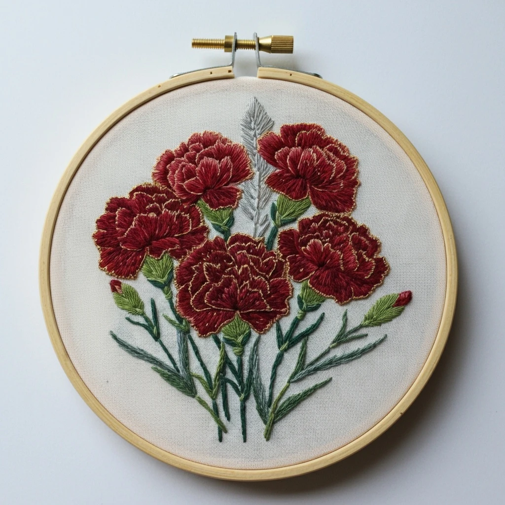
Ruby Carnation Cluster
A richly layered bouquet of ruby-red carnations with softly ruffled petals, muted golden edge accents, cool green stems, and a delicate silvery leaf detail. This guide translates the design into a polished DMC floss palette with practical stitch direction, thread-count suggestions, blending ideas, and beginner-friendly stitching advice.

Project Snapshot
A quick planning overview before you start stitching.
Overall color mood
Deep ruby, wine, and garnet reds balanced by olive, fern, and cool blue-green foliage on pale ivory fabric.
Recommended hoop & fabric
Use a 6–8 inch hoop with tightly woven cotton, cotton-linen, or linen in ivory, cream, or soft oatmeal.
Best uses for texture
Layered long-and-short stitch for the carnations, fishbone for leaves, and split/stem stitch for defined stems.
Good thread counts
1 strand for fine outlines and veins, 2 strands for most line work, and 2–3 strands for petals and fuller leaf areas.
Design Analysis
What stands out visually in the reference and how to translate it into thread.
The design reads as a cluster of richly textured carnations arranged in a natural bouquet. The petals are not flat—each bloom is built from many layered, scalloped petal segments. That means the best stitched result comes from breaking each flower into small sections and changing stitch direction between layers so the bloom feels full and ruffled.
The reds lean heavily into ruby, wine, and garnet rather than bright scarlet. A tiny amount of muted gold or warm tan appears along some petal edges, giving the flowers a softly illuminated outline rather than a harsh border. The foliage mixes yellow-green, olive, and deeper blue-green tones, helping the red petals stand out. A pale gray botanical accent behind the flowers adds airiness and depth.
Suggested DMC Color Palette
A practical palette matched to the visible shades in the design, with notes on how each color can be used.
How to Use the Palette
A stitcher-friendly breakdown of where each color works best.
| Color | Best placement | Practical use note |
|---|---|---|
| 814 / Deep Garnet Red | Innermost petals, underlayers, flower folds | Anchor the bloom with this first so the carnations feel dimensional from the beginning. |
| 815 / Medium Garnet | Main petal surfaces | This is the workhorse red. Use it to connect dark and light areas without making the bloom patchy. |
| 816 / Ruby Rose Red | Outer petal turns and upper light-catching areas | Best used in shorter stitches near the petal edge to preserve the ruffled carnation look. |
| 498 / Rich Crimson | Warm red accents and small buds | Use in moderation so it enriches the bouquet without overtaking the garnet family. |
| 738 / Light Wheat Gold | Selective edge highlights | A single strand is often enough. It should read as a glow, not a heavy outline. |
| 3828 / Antique Hazel Brown | Muted highlight outlines and warm detailing | Blend with 738 for a softer antique finish if the tan highlight feels too bright. |
| 3347 / Fresh Leaf Green | Leaf tops, buds, and calyx highlights | Place this toward the top or center of leaves so the greenery feels fresh rather than flat. |
| 3346 / Deep Fern Green | Leaf shadows and denser foliage | Excellent for anchoring leaves under the flowers, especially where stems overlap. |
| 3051 / Sage Green Gray | Soft foliage transitions | Use this to blend brighter greens into the cooler stems for a more refined botanical look. |
| 500 / Blue Green Deep | Stem lines and deepest green shadows | Best in 1–2 strands. It adds crisp structure without making stems look black or heavy. |
| 762 / Very Light Pearl Gray | Soft background leaf/spray | Use longer, airy stitches so this area stays light and slightly recessed. |
| 415 / Soft Steel Gray | Gray shadow accents | Add only in tiny amounts to deepen the gray spray or define its center rib. |
Stitch Types & Placement Suggestions
Recommended stitches to recreate the ruffled petals, tidy foliage, and soft background accents.
Flowers
- Long-and-short stitch: Best for most petal fills and color blending.
- Short satin stitch: Ideal for crisp petal tips and compact bud sections.
- Split stitch outline: Useful to map each petal tier before filling.
Leaves & buds
- Fishbone stitch: Great for fuller leaves with a visible center line.
- Straight stitch: Works well for narrow leaf blades and pointed bud scales.
- Detached chain: Optional for tiny leafy tips that need extra lift.
Stems & gray accent
- Stem stitch: Smooth and flexible for curved stems.
- Whipped backstitch: Good when you want a slightly raised stem line.
- Fine straight stitch: Best for the silvery spray or feather-like gray leaf.
Thread Count Guidance
How many strands to use for the cleanest and most practical result.
| Area | Recommended strands | Why it works |
|---|---|---|
| Petal outlines and tiny interior separators | 1 strand | Keeps the flower elegant and prevents the outlines from becoming bulky. |
| Main petal fill | 2 strands | Offers good coverage while still allowing smooth blending between red shades. |
| Raised petal highlights or compact buds | 2–3 strands | Adds body and helps small areas stand out, especially in satin stitch. |
| Stems and leaf outlines | 2 strands | Strong enough for structure without overpowering the design. |
| Leaf veins and gray spray detail | 1 strand | Creates a delicate botanical finish and keeps the background details airy. |
Blending, Shading & Outlining Ideas
Ways to make the bouquet feel more dimensional and polished.
Petal shading
Start with 814 in the deepest folds, work outward into 815, and finish with small touches of 816 on the upper petal edges. If a flower needs more warmth, add tiny areas of 498 near the center or on unopened buds.
Edge highlights
For the golden-looking rim, use 738 in a single strand as a selective split stitch or fine backstitch. If it appears too bright, soften it by alternating with 3828.
Foliage blending
Blend 3346 and 3347 in long, tapered stitches, then soften with a few stitches of 3051. Use 500 only in the deepest stems and overlaps.
Beginner-Friendly Practical Tips
Simple habits that help the design stitch up neatly and with less frustration.
1) Split the flowers first
Before filling, lightly outline the petal groups. Carnations have lots of small, scalloped sections, and marking them first makes the fill work much easier to control.
2) Stitch from back to front
Work the gray spray first, then stems and leaves, then the large carnations. This layering order helps the bouquet look natural and prevents awkward overlaps.
3) Keep reds in one family
If you are unsure when to change colors, switch only where the petal physically turns or dips inward. Small changes in placement matter more than using lots of extra shades.
4) Avoid thick outlines
The beauty of this design comes from the petal texture, not heavy borders. Keep outlines fine and let stitch direction create shape whenever possible.
5) Test the gold edge accent
Try a tiny sample with 738 first. On some fabrics, a full outline may feel too strong, so a few broken highlight stitches often looks better.
6) Press from the back
When finished, place the embroidery face down on a towel and press gently from the back. This preserves the raised texture in the carnations.